So the new computer is great. It’s not clogged up with grime, the desktop tower no longer wheezes like an asthmatic cat, and the letters on the new keyboard are nice and clicky, offering reassurance to all and sundry that work is in progress.
There’s really just one problem. My favourite font has gone AWOL.
Scrolling through the pull-down menu to change the default setting, I went from Aharoni to Wingdings three times before the shocking truth sunk in – I was in uncharted typographical terrain.
Now, I stopped using Times New Roman last century because it looked like it should stay there: hunched, crabbed thing that it is.
A serif typeface with fussy little feet and tips on the letters, it was so called because it was first commissioned by the UK Times newspaper in 1931.
For a long while I flirted with Arial, before settling on Calibri Light. While a typeface can never achieve the intimacy of handwriting, Calibri (and specifically my preferred Light variant, which is the one that’s vanished) has a rounder, cleaner, more open, friendly look.
This week in a hunt for a replacement I tested Batang but the serifs could be windsocks; Gulim was good but the gaps too big; more than three lines and DejaVu Sans Light looked like it had been drawn against a ruler by a school kid with his tongue hanging out in concentration. So now I’m trialling Segoe UI Light.
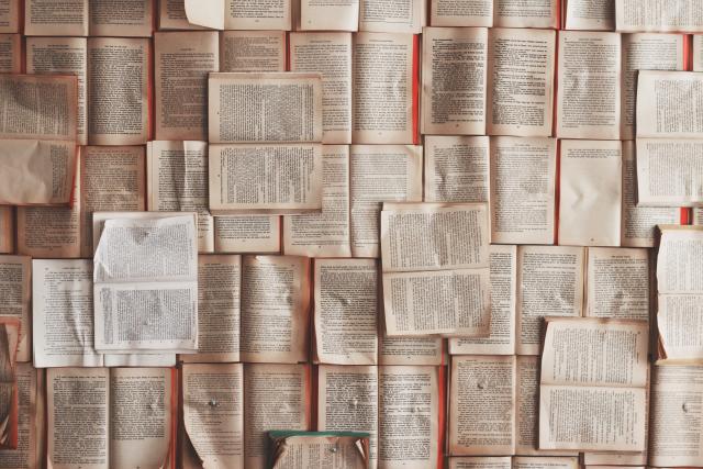
Beyond the very limited offerings of Open Office free software there are now more than 150,000 families of typestyle and 300,000 fonts available.
Some of them sound more like bad punk bands or horror movies, with names like Girls Are Weird, Lilac Malaria, Burning Wrath, Mrs. Strange, Dead Secretary, Poilet Taper and Girl Scout Bitch, which comes in three weights: Sarcastic, Sadistic and Just Plain Mean.
But dubious names aside, there is a lot riding on the fonts people use to communicate in every form, from huge roadside billboards to text messages.
The body copy of The Weekly Review, for example, is set in Minion Pro. It’s no coincidence that a book often called the typographer’s bible, The Elements of Typographic Style, is set in the same.
Designed originally for Adobe systems it’s incredibly flexible, features lovely ligatures and extra flair applications, but at the same time is reader-friendly and classically familiar.
I’m not saying empires have been won and lost on typeface, but studies have shown some fonts are more convincing, to the point that more people will believe a statement written in Baskerville than in Georgia and Trebuchet.
And, in a world where the number of clicks can determine whether you live or die, even a 2 per cent margin can make a huge difference.
Just like handwriting, typefaces have personalities that leave a subtle impression on the reader. Woe betide the political candidate or job aspirant who mails out in Comic Sans. Like writing an email all in CAPITAL LETTERS, some fonts say “warning, warning, danger, danger” – not a great message if it’s issuing from your bank, superannuation fund or gynaecologist.
This then is why Google recently spent 18 months tweaking its user-interface typeface Roboto – spending heaven knows how much to make changes imperceptible to most.
You could call it … em, em … the new fontier.
Does it matter?
Helvetica, yes!